Jump to a section
TL;DR
Hospitality categories still win on sheer review volume, Google remains the default power platform in most categories, and healthcare plus professional services stand out for response discipline. The bigger operational lesson is that "good review performance" does not look the same everywhere. Some industries need scale, some need freshness, some need platform fit, and some can win with lower volume if the rating profile and response behavior are strong.
Review data gets misread all the time because teams collapse everything into one number. They look at the average star rating, or the total review count, and assume the rest of the picture follows automatically.
It usually does not.
A hotel can have hundreds of reviews and still underperform if the wrong platform owns the category conversation. A professional services firm can have a much smaller profile and still look highly credible if the ratings are strong and the team responds consistently. A SaaS company can look healthy on Google and still be weak where software buyers actually compare vendors.
That is the reason this benchmark matters. It is not meant to act like a universal law of reviews. It is meant to give operators a more realistic cross-industry frame for what normal looks like, where the center of gravity sits, and where teams often misallocate effort.
OrderBoosts read: the right benchmark is rarely "get more reviews" in the abstract. The better question is "get the right kind of review momentum on the platform that actually influences buying in this category."
If you need the recency layer behind this analysis, start with our 2026 review recency benchmarks. If you want the monthly operating lens, pair this article with the review health score framework.
What this benchmark covers
This article uses four benchmark lenses:
- median review count by industry,
- average rating by industry and platform,
- platform dominance by industry,
- review response rate by industry.
Together, those four views are much more useful than any single chart on its own.
Volume tells you how much public proof a category usually carries. Ratings tell you what "good" tends to look like on the major platforms buyers actually see. Platform dominance shows where reputation work matters most. Response rate reveals whether operators in that category behave like active profile owners or passive collectors.
That last point matters more than many teams think. Reviews are not just a static asset. They are a visible operating system. Buyers infer a lot from whether a business seems active, responsive, and current. That is one reason response discipline links naturally with the freshness and trust patterns discussed in how to respond to negative reviews and our broader local SEO and Google reviews guide for 2026.
This is a mixed editorial and benchmark piece, not a claim that every number here comes from a formal public industry census. The charts are best read as an OrderBoosts benchmark model built to make cross-industry differences easier to act on. Where the charts show a clear pattern, we treat it directly. Where the interpretation goes beyond the visible bars and labels, we say so.
That distinction matters because operators make bad decisions when they treat benchmark charts like immutable truth. The useful way to read this piece is as a planning tool. It shows how the center of gravity changes by vertical and where expectations are clearly not uniform.
How to read these industry benchmarks
The first mistake teams make is assuming high review count automatically means high trust. It does not. Volume is context, not victory. Hotels and restaurants naturally accumulate more public feedback because they serve more customers, generate more frequent review occasions, and sit inside platforms where review behavior is already normalized. That does not mean a law firm or consultant with 25 reviews is weak by default.
The second mistake is comparing ratings across platforms as if a 4.2 means the same thing everywhere. It does not. Google tends to skew high in many local categories. G2 often behaves differently because software buyers write longer, more category-specific feedback. Trustpilot can be more polarized in some verticals. TripAdvisor has its own pattern in travel and hospitality. OrderBoosts benchmark: rating interpretation is only useful when it is tied to the platform norm and the category's buying journey.
The third mistake is ignoring platform concentration. If Google dominates your category, operational neglect there is expensive. If G2 is the real buying surface for your market, Google sentiment alone will not compensate. If TripAdvisor owns the trust conversation in hospitality, then generic review growth outside that platform may do less commercial work than teams expect.
The fourth mistake is treating responses as optional. Buyers see silence. They read delays as neglect. In categories where operator responsiveness is part of perceived professionalism, response rate becomes a trust signal in its own right. That is why response behavior belongs in the same operating conversation as recency, cadence, and review routing.
This is also why benchmarks should not be copied blindly across categories. The best benchmark is the one that matches your customer volume, your platform mix, and the place where buyers actually hesitate or convert.
Median review count by industry
The volume chart makes the clearest pattern visible immediately: hospitality-heavy categories lead by a wide margin.
Median Review Count by Industry
Hotels and restaurants lead in review volume, while professional services sit at the leanest review baseline.
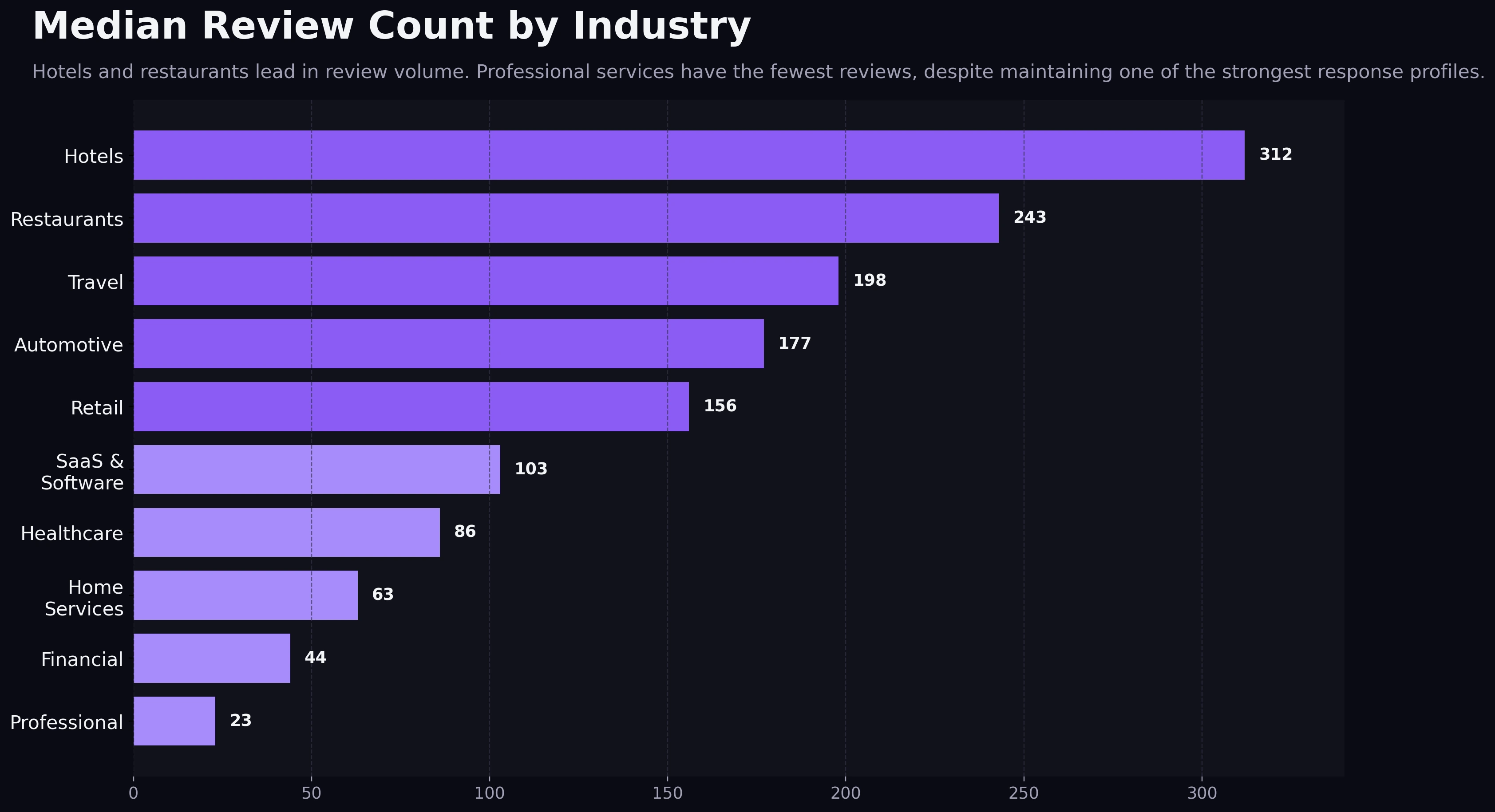
Hotels appear at roughly 310 median reviews, restaurants at roughly 240, with travel and automotive following behind. That puts hospitality in a different public-proof environment from the rest of the field. Customers expect lots of visible feedback there, and the platforms themselves are built around that expectation.
Retail and SaaS sit in the middle, while healthcare, home services, financial services, and professional services fall much lower. Professional services are the most striking example. The chart calls out a 23-review median, which is tiny relative to hospitality, but that low number should not be misread as dysfunction. In many expert-led categories, review occasions are less frequent, customer volume is lower, and trust comes from a mix of quality, specificity, and responsiveness rather than raw count alone.
OrderBoosts read: volume benchmarks are really expectation benchmarks. Hotels do not just have more reviews because they are better at asking. They operate in a market where customers expect to review and where travelers actively filter using those signals. Professional services do not have fewer reviews because they are failing. They operate in a market where a smaller number of strong, believable reviews can still carry a lot of decision weight.
That has a direct planning implication. If you run a hotel, "we have 30 reviews" can be a serious visibility problem. If you run a niche B2B advisory firm, 30 well-written reviews plus active responses can be a respectable trust footprint. The right benchmark is always category-adjusted.
Average rating by industry and platform
The rating chart shows a second pattern that operators often miss: the strongest visible rating is usually platform-dependent, not category-independent.
Average Rating by Industry and Platform
Google trends highest in most industries, while G2 is the standout category-specific trust surface in SaaS.
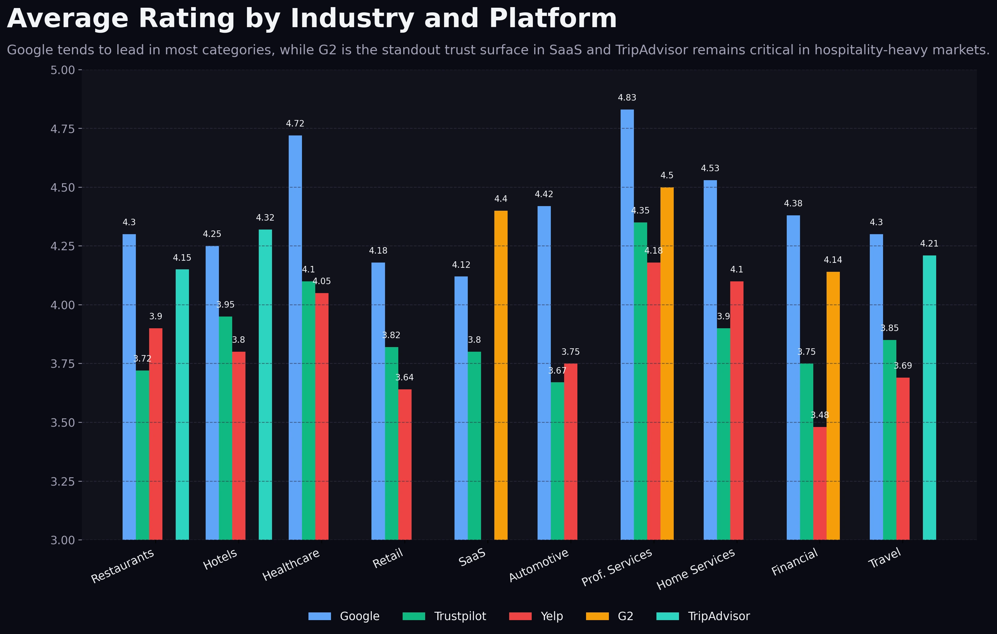
Google ratings skew highest in most industries shown. That is not especially surprising. Google captures broad local intent, has huge user familiarity, and often becomes the default surface where casual buyers get a first impression. In restaurants, hotels, healthcare, automotive, home services, financial services, and professional services, Google sits at or near the visible high point.
The most important exception is SaaS, where G2 outpaces Trustpilot by a meaningful margin and appears to be the strongest category-specific benchmark. That is not just a nice chart detail. It reflects buying behavior. Software buyers do not merely want reassurance that a company exists. They want implementation proof, feature fit, support quality, and product maturity. G2 is built for that kind of comparison in a way general-purpose platforms are not.
There are smaller nuances too. TripAdvisor remains highly relevant for hotels and travel-adjacent categories, while Yelp still matters in categories where local service comparisons carry strong Yelp visibility. But the chart's most useful lesson is that teams should stop asking, "What is a good rating?" as a universal question.
A better question is:
"What rating range looks convincingly strong on the platform that buyers in our category trust most?"
That framing protects teams from the two biggest rating errors:
- chasing perfection on a platform that matters less,
- underinvesting on the platform where buyers actually compare providers.
If you need a more operational framework for turning rating goals into action, the Review Velocity Planner is the cleaner next step than guessing from raw star averages alone.
Which platform matters most by industry
Platform dominance is where benchmark reading becomes strategically useful.
Platform Dominance by Industry
Google dominates most industries, but TripAdvisor leads hotels and G2 leads SaaS where platform fit matters more than raw volume.
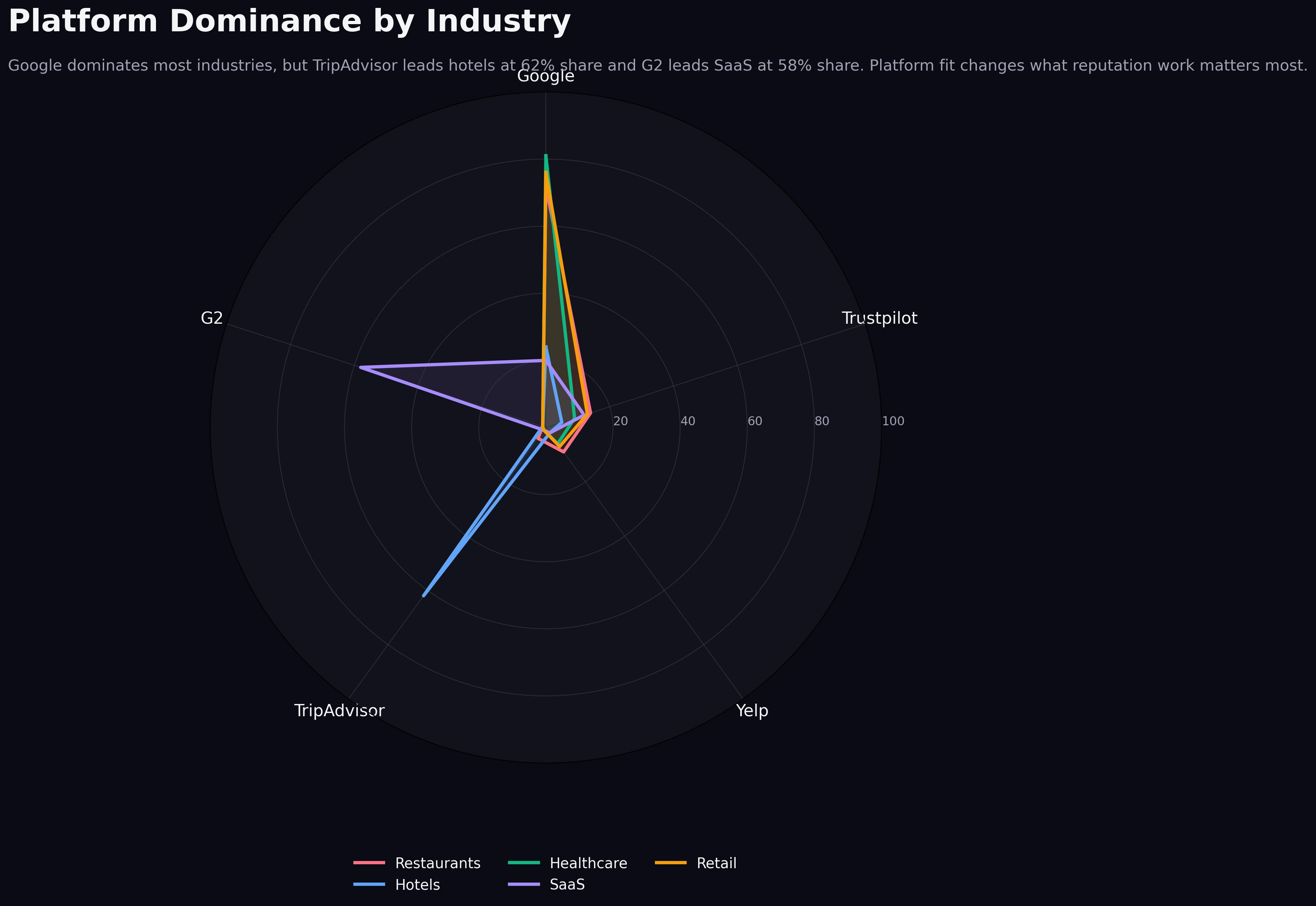
The chart subtitle gives away the main point: Google dominates most industries, but TripAdvisor leads hospitality with a 62% share and G2 leads SaaS with a 58% share. That is the most operationally important takeaway in the entire article because it tells you where reputation work compounds fastest.
In Google-led industries, profile maintenance on Google is not optional. Recency, response behavior, rating stability, and visible review flow all stack on top of each other there. This is especially true in local and service-driven markets, which is why the Google-focused operating advice in local SEO and Google reviews in 2026 remains relevant even when a business also monitors other platforms.
In hospitality, TripAdvisor changes the equation. A hotel can look healthy on Google but still underperform in the travel decision layer if TripAdvisor is stale or weak. Buyers planning trips often compare properties inside a travel-native context, not just a local search context. The platform fit is different, so the benchmark should be different too.
In SaaS, the same principle applies with G2. A high Google rating helps with branded trust, but G2 does more commercial work during shortlist evaluation. OrderBoosts benchmark: if your buyers compare vendors on G2, then G2 review depth, detail, and recency deserve more operating attention than vanity improvements elsewhere.
That is the strategic use of dominance data. It tells teams where to put scarce energy first.
Review response rate by industry
Response rate is where professionalism becomes visible.
Review Response Rate by Industry
Healthcare and professional services respond more consistently, while retail sits at the weakest visible response baseline.
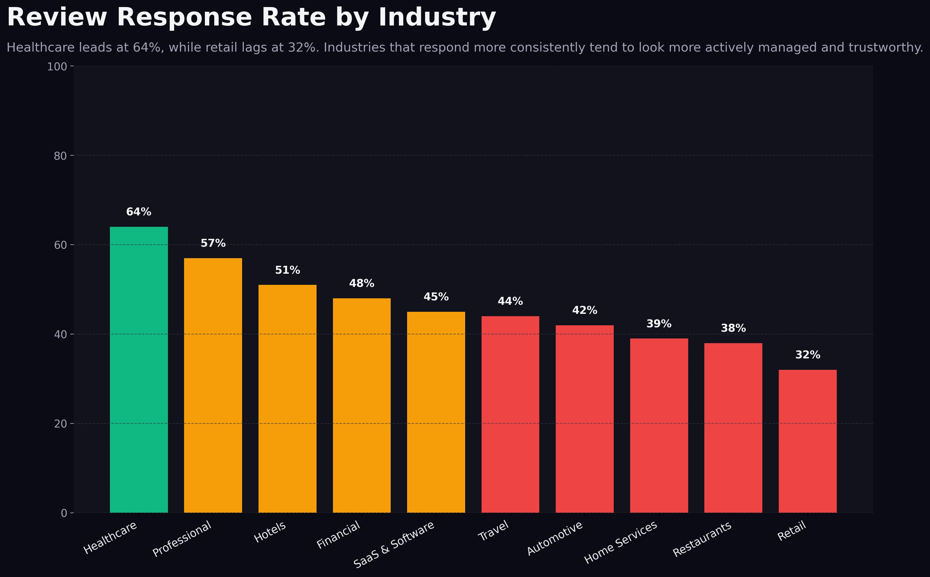
Healthcare leads at 64%, while retail trails at 32%. Professional services also sit high, near the upper 50s. Hotels are around the 50% range, while travel, automotive, home services, restaurants, and retail cluster lower.
This pattern is not random. In healthcare and professional services, response quality is part of the brand itself. Buyers expect attentiveness, seriousness, and active stewardship. Silence looks careless. That naturally pushes operators toward higher response discipline.
Retail sits on the opposite end because scale, channel complexity, and operational fragmentation often make response coverage weaker. That does not mean retail buyers do not care. It means the operating system is usually harder to maintain consistently.
OrderBoosts read: higher response rates tend to coexist with stronger average ratings because both behaviors usually reflect the same underlying reality. Teams that monitor feedback closely tend to respond more. Teams that respond more tend to catch service problems faster. That feedback loop improves trust before the next review is even written.
Response rate is also one of the easiest benchmark gaps to improve without waiting months for volume to accumulate. A team cannot create a mature 200-review profile overnight. It can, however, establish response SLAs, assign ownership, and start looking materially more active within a week.
Industry-by-industry breakdown
Hotels
Hotels sit at the top of the volume curve. That creates both an opportunity and a burden. Large review archives give hotels enormous trust leverage, but they also raise the threshold for what looks normal. Buyers expect lots of recent feedback, and TripAdvisor plays an outsized role in that interpretation. OrderBoosts benchmark: hotels should treat high review count as table stakes, not a differentiator.
Restaurants
Restaurants also operate in a high-volume environment, but the platform mix skews more heavily toward Google and local discovery surfaces. Ratings matter, but so does visible freshness and owner engagement. A restaurant with strong stars and weak response behavior may still look less credible than a competitor with slightly lower stars and much more active profile stewardship.
SaaS & Software
SaaS is the cleanest example of platform-specific review economics. Volume matters, but not in the same way as hospitality. Buyers want enough review depth to trust the product, but they care even more about whether the right platform carries that trust. G2 leading SaaS is the central lesson. OrderBoosts read: software operators should not let good Google sentiment mask weak G2 credibility.
Healthcare
Healthcare stands out for response discipline and solid ratings despite lower review volume than hospitality. That combination is powerful. Patients often interpret responsiveness as evidence of professionalism and care quality. A smaller but well-managed profile can therefore outperform a larger but neglected one.
Professional Services
Professional services have the lowest median review count in the benchmark yet one of the strongest response profiles and among the highest visible ratings. That is the clearest proof that low volume does not automatically mean low trust. In advisory, legal, accounting, and consulting categories, a compact set of high-quality reviews can still do meaningful commercial work when the profile is actively managed.
Retail
Retail sits in an awkward middle position. It is not as volume-rich as hospitality, and it trails badly on response rate. That usually means the trust layer is under-operated. Retail brands often focus heavily on acquisition, merchandising, and fulfillment while review responses become nobody's clear responsibility. Benchmark read: retail operators can often earn a visible trust advantage simply by improving response coverage faster than competitors.
Cross-industry benchmark table
| Industry | Median review count | Highest typical rating platform | Dominant platform | Response rate | Operational read |
|---|---|---|---|---|---|
| Hotels | ~310 | Google / TripAdvisor range | TripAdvisor-led hospitality mix | ~51% | High-volume category where stale travel-platform coverage is expensive. |
| Restaurants | ~240 | ~38% | Big volume helps, but weak response discipline can still drag trust. | ||
| Travel | ~200 | Google with strong TripAdvisor support | TripAdvisor-leaning hospitality pattern | ~44% | Travel buyers still use category-native trust surfaces heavily. |
| Automotive | ~178 | ~42% | Google visibility likely does most of the commercial work here. | ||
| Retail | ~155 | 32% | Retail is the weakest visible response environment in the benchmark. | ||
| SaaS & Software | ~103 | G2 | G2 | ~45% | Lower volume can still work if the right reviews land on the right platform. |
| Healthcare | ~86 | 64% | The strongest response behavior in the set supports trust even at lower volume. | ||
| Home Services | ~63 | ~39% | Review freshness and owner replies likely matter more than raw count alone. | ||
| Financial | ~45 | ~48% | Smaller profile sizes mean quality and consistency matter more than scale. | ||
| Professional Services | 23 | ~57% | Lowest volume, but strong ratings and response behavior can still create a premium trust signal. |
The table is useful because it compresses the real lesson of the charts into one operating view: each category has a different trust architecture.
Hotels and restaurants live inside abundance. Professional services and financial categories live inside scarcity. SaaS lives inside platform specialization. Healthcare lives inside responsiveness. Retail lives inside an under-answered opportunity.
That is why teams get into trouble when they benchmark themselves against the wrong market. A SaaS team chasing hospitality-style review totals will waste effort. A hotel team treating 40 reviews as sufficient will probably undershoot category expectations badly. A professional services firm that assumes 20 reviews is enough forever may miss the fact that stronger response discipline, fresher activity, and better platform routing would still move conversion.
What these benchmarks mean for operators
The first implication is simple: volume targets should be category-relative, not universal. A business should know whether it operates in a high-proof market or a low-proof market. That determines whether the next best move is scale, freshness, or platform focus.
The second implication is that platform prioritization is not a branding preference. It is a buying-journey decision. If your category is Google-led, Google deserves operational priority. If your category is SaaS, G2 deserves more attention than generic review surfaces. If your category is travel-heavy, TripAdvisor cannot be treated as optional.
The third implication is that response rates are not a vanity metric. They are one of the clearest signs that a profile is being actively managed. In some industries, response behavior may be the fastest trust upgrade available because it changes how the profile feels before it changes how large the profile is.
The fourth implication is that rating quality should be interpreted with platform context. Teams that obsess over absolute stars without looking at where buyers compare options often overreact to the wrong signal. A slightly lower but believable score on a high-intent platform may be commercially stronger than a prettier number on a platform buyers barely use.
The fifth implication is that benchmark gaps should become workflow changes, not just observations. If healthcare leaders respond faster, that should turn into an SLA. If SaaS leaders win on G2, that should turn into routing logic. If hospitality leaders benefit from scale, that should turn into a more aggressive collection cadence.
How to use this data in planning
The practical use of benchmark data is not to admire it. It is to decide what changes next month.
Start with three questions:
- Which platform currently does the most trust work in our category?
- Are we underweight on volume, freshness, or response behavior relative to the benchmark pattern?
- Which single operational change would close the most commercially important gap first?
For Google-led categories, planning usually starts with cadence and recency. You need steady inbound review flow, visible owner engagement, and a profile that looks current rather than historical. That is where the cadence logic in the Review Velocity Planner becomes useful.
For SaaS, planning should start with routing. The key question is not "How do we get more reviews anywhere?" It is "How do we move enough high-quality customer feedback onto G2 to influence shortlist decisions?" That may mean changing when you ask, which customer moments you target, and how customer success and marketing coordinate.
For hospitality and travel, planning should start with platform fit and review freshness together. Large review archives help, but old archives alone do not create the same level of reassurance as steady recent activity. That is one reason the recency patterns in review recency benchmarks for 2026 matter so much for high-volume categories.
For healthcare and professional services, planning should start with response ownership and review quality. These categories often do not need hospitality-scale review counts to look trusted. They do need proof that the profile is alive, cared for, and representative of the current client or patient experience.
For retail, a strong first move is often operational discipline rather than volume chasing. Raise response coverage, reduce lag, clarify ownership, and build a more active stewardship pattern. In under-answered categories, that kind of move can create outsized differentiation quickly.
OrderBoosts benchmark: the best planning stack usually follows this order:
- identify the platform that matters most,
- define the minimum believable cadence,
- assign response ownership and SLA,
- monitor rating drift and recency together,
- revisit the benchmark every quarter instead of once a year.
If teams do only that, they already stop making the most expensive benchmark mistake, which is copying another industry's review strategy without copying its market conditions.
Conclusion
Review benchmarks only become useful when they change decisions.
This dataset shows four durable patterns. Hospitality categories need much more visible proof. Google still dominates most industries. G2 matters disproportionately in SaaS, and TripAdvisor matters disproportionately in hospitality. Healthcare and professional services show that lower volume can still work when ratings and response behavior are strong.
That should change how operators set goals. The goal is not to pursue some universal review number. The goal is to build the trust profile that fits your category's buying journey and platform reality.
OrderBoosts read: review strategy gets dramatically better when teams stop chasing generic growth and start managing for category-fit trust.
Contributor Callout
Have benchmark data, a case study, or an operator perspective on review management? Pitch a guest post or collaboration.